Projects
House2Home - Desktop Web
CASE STUDY | PROTOTYPE

CONTEXT
This project is a modified GV Design Sprint, completed over the course of 5 days. Provided with a number of design briefs pertaining to fictional products, I chose ‘House2Home’, an e-commerce website where users can shop for small home decor accessories.
House2Home does not sell any large items or furniture. The problem space, as noted below, revolved around the idea that many shoppers feel overwhelmed with choice when it comes to home decor, and do not feel confident in picking out small items to create a cohesive style for their home.
House2Home is a new start-up that wants to help shoppers decorate their new homes and apartments.
Their users want to buy multiple items to decorate their space, but they don’t feel confident doing it on their own.
Offering a curated starter kit of decor and home accessories would allow shoppers to achieve a cohesive ‘look’ for their homes, without the stress of balancing a budget and choosing from the endless options available in store and online.
Working with the existing brand, proposed idea, and preliminary UX research, I worked through the entire design process, from initial sketches to presenting a finished prototype, and conducted user testing of the prototype draft.
DAY #1
The first step in the design process for House2Home was reviewing the UX research, which included written feedback, a user interview, as well as a user persona- these were all resources that were provided in the design brief. From this information, I was able to create a preliminary end-to-end user experience flow for the Starter Kit solution.
The written feedback from the ficticious users was in the form of direct quotes, stating both their positive and negative feelings around shopping for their new spaces. The lack of confidence in choosing the right items to acheive a cohesive look was a common pain point, in addition to feeling overwhelmed by choice, and the concern of sticking to a reasonable budget.
I know the ‘look’ I want, and how I want to feel when I walk in…I just don’t really know what products to buy to pull it off.
-Deena
I find lots of cool little items that I like, but I never know if they’ll look good together in the same room until I buy them. Usually, I get overwhelmed and end up not buying anything.
-Dan

“Ally” is the user persona created from synthesizing
the research performed.
Ally just moved into her first apartment after graduating from college, and spends a lot of time browsing Pinterest for decor ideas. Although Ally spends a lot of time shopping for items for her new home, she often gets overwhelmed and decides that she will shop some other time.
Ally knows the look the she wants for her space, but doesn’t know how to choose the right items for the perfect combination. The inspiration pictures she saves have many items in them to create a cohesive look- how can she achieve a similar aesthetic with only a selection of the items?
The preliminary end-to-end user experience map shows the path the shopper will take to arrive at their curated decor Starter Kit.
I added notes for the possible category/item selections that a shopper might see when they are experiencing the process.

DAY #2
The direction this design needed to take became more clear after wrapping up the initial user research and end-to-end user flow. The idea of professional help with decor ideas isn’t a new one, so next I had a look at how some other companies handled the task.
LIGHTNING DEMOS
First I looked at ‘Havenly’ (www.havenly.com). Users are shown a selection of interior photos, prompted to select their favourites, and a design style is presented. Users then go through a series of questions like their budget, what types of items they’re looking for, what type of space, etc., and then they are matched with a designer to work with. Users are also given two price package options.

Next, I found 'Living Spaces' (www.livingspaces.com). Living Spaces allows users to select a style, select from a collection of interior photos that match that style, and then shop the items in the selected photo. Users can also design a room from scratch with real-life items that can be purchased. The room that is designed can be customized to any shape/size, and the user can generate a 3D image of their design.


My final stop was 'Wayfair' (www.wayfair.com). Wayfair.com is a very successful e-commerce site that allows users to browse by room, item type, and style. If a user knows that they love the Bohemian style, they can easily filter the site’s many items to only show items of that style, from furniture right down to small accessories.


CRITICAL SCREEN
Getting a bunch of thoughts down on paper, without thinking about ‘the good, the bad and the ugly’ through the Crazy 8’s exercise was the first step in fleshing out the design of the ‘Item Type’ screen- this was decided as the critical screen, as this is where the shopper would decide what items they need to complete their space.
Following the determination of what room they were shopping for, in addition to the approximate room size, budget and style/colour inspiration for their space, shoppers would consider the items they already had, as well as the amount of available space in their room of choice, in order to arrive at their ‘wish list’ of needed items.

SOLUTION SKETCH
With the critical screen determined, a solution sketch was created to demonstrate the screens that the shopper would see directly before and after during their experience. In this scenario, these screens were initially determined to be the design style selection, followed by the Starter Kit size options. In the final design, an additional screen for colour palette selection was added after the design style selection, before the critical screen.

DAY #3
Considering the lightning demos and solution sketches, rough sketching the screens to complete the end-to-end user experience really started to bring the project to life. I created 8 screens to get the general feeling of the flow before moving the design into a digital format. Keeping in mind the user persona, and one of the primary pain points of feeling overwhelmed with choice, I knew from the beginning that I wanted a clean, high-contrast aesthetic without a lot of bells and whistles, incorporating a balance of structure and flexibility.


I wanted to continue a basic, tiled layout instead of classic buttons, in order to include visual cues in each category- again, considering the user persona and their attitude/behaviour towards decorating their homes. Although the layout of the tile-style buttons would change in the final design, the initial sketch layout of a grid-style design kept each question visually consistent and familiar throughout the experience.
DAY #4
When I can start playing with the digital format- colour, typeface, layout- is when I really start ‘getting into’ a build. Sticking with a clean, uncluttered design allowed me to stay relatively true to my storyboard sketches. Keeping in mind the simplicity and clarity that the user persona craves, photographic images prompt the shopper through the process, along with clear action indicators and a linear experience.


DAY #5
The first draft of the prototype was tested with 5 users, with one in-person test and the rest via online conferencing (in this instance, Zoom app). The prototype was designed in Sketch and built in InVision Studio.
For the most part, my test users were happy with the experience and felt that the questions asked and the end results presented were along the lines of what they would expect when putting themselves in the ‘role’ of the persona. There was one consistent pain point- all but one test user commented that, although they understood the need for structure in the arranged started kit, they felt that having the option to ‘swap out’ items for similar pieces would be useful.
This feedback encouraged me to make the only substantial change in the prototype- a notation was made on the starter kit contents screen, directing users to click on each item in the kit if they would like to change for a different item in that category. I found that adding the ‘swap out’ feature eliminated the need for the ‘Start again’ button.
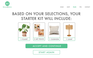

With the edit, users can click on each item in their kit and view two additional options per item type to choose from. In a real-world scenario, these options would be of similar pricing, so as to not tempt the user to spend more than their budget allows.

Providing deeper clarity with the ‘View in your space’ interaction was another area of improvement mentioned by several users. I updated the wording to provide better visual cues of the activity, as well as clearer exit/advancement CTAs.


Jumping into this project after the initial steps were completed was definitely a different experience! Having a primary focus on visual design, I appreciated not having to complete the majority of the UX research portion of this project. While I am more than capable of performing all preliminary research for a build, my passion lies in the design process.
My final draft of the House2Home prototype is, I would say, about 95% ready for a real-world application. Ideally, I would run another session of user testing with the changes I made based on my first round. I would also like to test out a few options of a ‘Cart’ screen - taking the feedback regarding having a level of control over the items in the kit, I’d be interested to see if having an option to increase or decrease the quantity of the category items (while maintaining the set budget) would be an improvement to the user experience.
Aside from the additional changes that could be made, I feel that the current iteration of the House2Home prototype provides a realistic experience of the given task.

